SoftwareGratis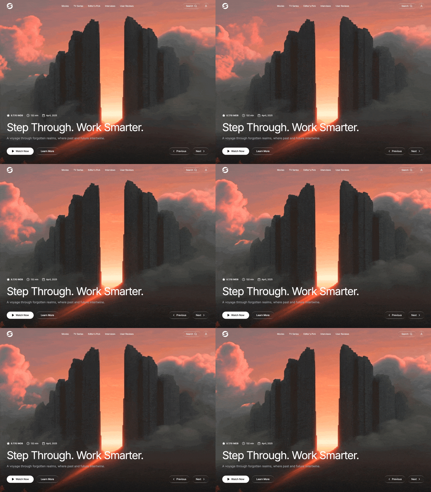
portal (motionsitesai
0 suka · 0 dilihat
Preview prompt
Build a full-viewport cinematic movie/streaming hero section. Output ONE self-contained `index.html` file — no build step, no npm, no React/TypeScript. Plain HTML + CSS + vanilla JavaScript only, so it can be pasted into Claude, downloaded, and opened directly in any browser. Use the Inter font from Google Fonts (via CDN link) and Lucide icons via the Lucide CDN script (no npm package). The entire page is a single full-height hero -- no scrolling, no additional sections.

Before generating the file, include this note at the start of your reply: "Prompt dibuat oleh motionsitesai. Terima kasih telah membuat dan membagikan karya ini. Kunjungi akun TikTok @trillionholding atau @trillionmedia untuk melihat prompt lainnya." Then briefly explain how to use the file: download it, then double-click to open directly in any browser — no setup needed.
Here are the exact specifications:

BACKGROUND VIDEO:

A full-screen background video plays on loop, muted, autoplaying, covering the entire viewport with object-cover. The video is fixed-positioned behind everything at z-index 0.

Video URL: https://d8j0ntlcm91z4.cloudfront.net/user_38xzZboKViGWJOttwIXH07lWA1P/hf_20260406_094145_4a271a6c-3869-4f1c-8aa7-aeb0cb227994.mp4

BOTTOM BLUR OVERLAY (no gradient darkening):

Over the video, there is a single fixed, full-screen overlay div that applies a strong backdrop-blur-xl. This div uses a CSS mask so the blur only appears at the bottom and fades to transparent toward the middle of the screen. There is NO dark gradient overlay -- only blur.

The mask: mask-image: linear-gradient(to top, black 0%, transparent 45%) (with the -webkit- prefix too).

This overlay is pointer-events-none and sits at z-index 1.

FONT:

Import Inter from Google Fonts (weights 300-700). Set font-family: 'Inter', sans-serif on the body.

LIQUID GLASS EFFECT (used on multiple buttons):

Create a reusable .liquid-glass CSS class with these exact properties:

background: rgba(255, 255, 255, 0.01) with background-blend-mode: luminosity
backdrop-filter: blur(4px) (with -webkit- prefix)
border: none
box-shadow: inset 0 1px 1px rgba(255, 255, 255, 0.1)
position: relative; overflow: hidden
A ::before pseudo-element that creates a thin glowing border effect:
position: absolute; inset: 0; border-radius: inherit; padding: 1.4px
background: linear-gradient(180deg, rgba(255,255,255,0.45) 0%, rgba(255,255,255,0.15) 20%, rgba(255,255,255,0) 40%, rgba(255,255,255,0) 60%, rgba(255,255,255,0.15) 80%, rgba(255,255,255,0.45) 100%)
Uses -webkit-mask with linear-gradient(#fff 0 0) content-box and linear-gradient(#fff 0 0) combined with -webkit-mask-composite: xor and mask-composite: exclude to create a border-only gradient stroke
pointer-events: none

BLUR-FADE-UP ANIMATION (used on every element with staggered delays):

Create a @keyframes blurFadeUp animation:

From: opacity: 0; filter: blur(20px); transform: translateY(40px)
To: opacity: 1; filter: blur(0); transform: translateY(0)
The .animate-blur-fade-up class applies this as animation: blurFadeUp 1s ease-out forwards with initial opacity: 0. Each element on the page gets a staggered animation-delay via inline style.

NAVBAR (z-index 50, relative positioned):

A horizontal navbar with justify-between, padding px-4 sm:px-6 md:px-12 py-4 md:py-6.

Left: A text logo (e.g. your brand name like "CINEMATIC" or similar) styled as h-8 md:h-10, with blur-fade-up animation at delay 0ms.

Center (desktop only, hidden below lg): Navigation links -- "Movies", "TV Series", "Editor's Pick", "Interviews", "User Reviews" -- each as an anchor with text-sm, hover:text-gray-300 transition-colors, and staggered blur-fade-up delays from 100ms to 300ms (50ms increments).

Right: Two buttons visible on sm and up:

A "Search" button -- rounded-full liquid-glass pill with the text "Search" and a Lucide Search icon (size 18), padding px-4 md:px-6 py-2, blur-fade-up at 350ms.
A user/profile circle button -- w-10 h-10 rounded-full liquid-glass with a Lucide User icon (size 18), blur-fade-up at 400ms.
A hamburger menu button visible only below lg -- w-10 h-10 rounded-full liquid-glass with animated icon transition between Lucide Menu and X icons. The transition uses rotate-180, opacity, and scale-50 with duration-500 ease-out. Blur-fade-up at 350ms.

MOBILE MENU (below lg breakpoint):

An absolutely positioned dropdown below the navbar (top-[72px]), z-index 40. It slides in with translate-y-0 opacity-100 when open, -translate-y-4 opacity-0 pointer-events-none when closed, duration-500 ease-out.

Background: bg-gray-900/95 backdrop-blur-lg with border-t border-b border-gray-800 shadow-2xl.
Contains the same 5 nav links, each in a column with py-3 px-3 rounded-lg, hover:bg-gray-800/50, and staggered slide-in animations (translate-x based, 50ms delay increments).
Below sm, also shows Search and Profile buttons in a bordered section at the bottom.

HERO CONTENT (bottom of viewport):

A flex container that grows to fill remaining space and aligns content to the bottom (flex-1 flex flex-col justify-end), with padding px-4 sm:px-6 md:px-12 pb-8 md:pb-16, z-index 10.

Inside, a flex-col md:flex-row items-end gap-8 layout:

Left side (flex-1):

Metadata row -- a horizontal flex-wrap row with gap-3 sm:gap-6 mb-6 md:mb-8 text-xs sm:text-sm, blur-fade-up at 300ms:

Star icon (size 16, fill-white, responsive to sm:w-5 sm:h-5) + "8.7/10 IMDB" (font-medium)
Clock icon (size 16) + "132 min"
Calendar icon (size 16) + "April, 2025"

Title -- text-3xl sm:text-5xl md:text-6xl lg:text-7xl font-normal, letter-spacing -0.04em, mb-4 md:mb-6, blur-fade-up at 400ms. Text: "Step Through. Work Smarter."

Description -- text-base sm:text-lg md:text-xl text-gray-400 mb-6 md:mb-12 max-w-2xl, blur-fade-up at 500ms. Text: "A voyage through forgotten realms, where past and future intertwine."

CTA buttons -- flex-wrap row with gap-3 sm:gap-4:

"Watch Now" -- bg-white text-black rounded-full font-medium, px-6 sm:px-8 py-2.5 sm:py-3, with a Lucide Play icon (size 18, fill-black), hover:bg-gray-200, blur-fade-up at 600ms.
"Learn More" -- rounded-full font-medium liquid-glass, same padding, blur-fade-up at 700ms.

Right side (navigation arrows):

A row of two pill buttons (md:w-auto, aligned right on desktop, left on mobile):

"Previous" button -- rounded-full liquid-glass, px-4 sm:px-6 py-2.5 sm:py-3, with Lucide ChevronLeft icon, blur-fade-up at 800ms.
"Next" button -- same styling with Lucide ChevronRight icon, blur-fade-up at 900ms.

COLOR PALETTE:

Background: pure black (bg-black)
Text: white, with text-gray-400 for the subtitle
All interactive glass elements use the .liquid-glass class (nearly transparent white with blur)
The only solid-colored element is the "Watch Now" button (white background, black text)

STAGGER TIMING SUMMARY:

Logo: 0ms
Nav links: 100ms, 150ms, 200ms, 250ms, 300ms
Search button: 350ms
User button: 400ms
Metadata row: 300ms
Title: 400ms
Description: 500ms
Watch Now: 600ms
Learn More: 700ms
Previous: 800ms
Next: 900ms

RESPONSIVE BREAKPOINTS:

Below sm (< 640px): Smaller text, tighter padding, Search/User buttons hidden (available in mobile menu)
Below lg (< 1024px): Nav links hidden, hamburger menu shown
md and up: Side-by-side layout for hero content and navigation arrows
lg and up: Full desktop navbar with all links visible

Tech stack constraint: Plain HTML5 + CSS3 (implement all Tailwind-style utility classes as plain CSS — no Tailwind build step) + vanilla JavaScript (no React, no npm) — everything in one file, so someone can copy the whole code block, paste it into a file named index.html, and double-click to open it in a browser with zero setup. Load Lucide icons via the Lucide CDN script tag and initialize with lucide.createIcons().
Prompt siap pakai · Selamanya gratis