Landing PageGratis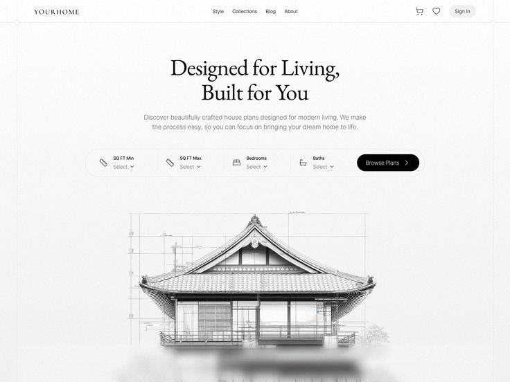
PREMIUM HOUSE
0 suka · 0 dilihat
Preview prompt
Build a premium architectural landing page hero section for brand "WEBSITE KAMU" — Architecture / Real Estate / Custom Home Plans niche, sophisticated and minimal tone, targeting a global/Western market. Output ONE self-contained index.html file — no build step, no npm. Embedded CSS + vanilla JavaScript + GSAP via CDN script tags (gsap.min.js and ScrollTrigger.min.js), so it can be pasted into Claude, downloaded, and opened directly in any browser.
Load-in animation reliability constraint: the hero headline, subheadline, filter bar, and visual must be visible even if GSAP fails to load or JS is blocked (some mobile browsers/WebViews block third-party CDN scripts). Drive the load-in sequence with CSS @keyframes + animation-fill-mode: both as the primary mechanism. GSAP/ScrollTrigger should only be used for the scroll-linked parallax effect described below, never for the initial page-load reveal — nothing on the page should depend on JS executing in order to become visible.
Color Palette
Kode
Fonts
Primary (display/headline): elegant serif — Playfair Display, GT Super, or Fraunces — 56px–72px.
Secondary (body/UI): clean geometric sans-serif — Inter or DM Sans — 14px–16px.
Load both via Google Fonts CDN link.
Layout Overview
Single-column, center-aligned text flow over a full-bleed light background, anchoring a dense horizontal filter-bar UI element. Desktop-first (the filter bar needs real width to lay out horizontally). Background is a static light color layered with a subtle architectural blueprint grid behind the central visual. Visual hierarchy top to bottom: Navbar → Hero Headline/Subheadline → Floating Filter Bar → Architectural House Sketch (with Blueprint Grid behind it).
Element Inventory
Global Navbar — fixed/sticky, top, full-width, height ~72px. Transparent background initially, minimal padding. Left: brand text "WEBSITE KAMU". Center: 4 nav links (Style, Collections, Blog, About). Right: 2 icon buttons (cart, heart/saved) + a "Sign In" pill button — light grey background (#F3F3F3), dark text, border-radius 9999px.
Hero Headline — top-center, below navbar. Large serif text, 56px–72px (responsive), color #1A1A1A, multi-line, center-aligned, tight line-height. Text: "Designed for Living, Built for You".
Hero Subheadline — directly below headline, center-aligned. Sans-serif, color #6B6B6B, max-width ~600px, line-height 1.6, font-size 16–18px. Text: "Discover beautifully crafted house plans designed for modern living. We make the process easy, so you can focus on bringing your dream home to life."
Plan Filter Bar — centered, positioned so it intersects the bottom of the hero text and the top of the visual below it. White pill-shaped container (border-radius 9999px), max-width ~900px, height ~72px, subtle drop shadow (0 4px 24px rgba(0,0,0,0.06)), divided into segments by thin vertical separator lines. Contains 4 filter segments + 1 submit button, all elevated above the blueprint visual in z-index.
Filter Segment (×4) — flows left to right inside the filter bar. Each has a left-aligned inline SVG icon (ruler, bed, bathtub icons), a small uppercase label above ("SQ FT Min", "SQ FT Max", "Bedrooms", "Baths"), and placeholder text below ("Select ⌄"). Hover state: background shifts to #F8F9FA, cursor pointer. Click reveals a dropdown (build the UI shell / static interactive trigger — full dropdown menu behavior can be mocked/left static for this view).
Browse Plans Button — far right inside the filter bar. Black pill shape, white text, "Browse Plans" label with a right-chevron icon.
Blueprint Grid Background — full-width, positioned behind the house sketch in the lower half of the hero, fading out at the edges. Light grey geometric grid lines with subtle blueprint-style technical markings (e.g. a couple of thin rectangular "dimension" outlines). Implement this as pure CSS (repeating linear-gradient grid lines + a radial-gradient mask to fade the edges), not an external placeholder image — third-party placeholder-image services often render visible dimension/label text on top of the image when no real asset is supplied, which would show up as ugly text on the page. Keep this element purely decorative (aria-hidden) and centered behind the house sketch.
Architectural House Sketch — bottom-center of the hero, very large, dominates the lower viewport. Highly detailed pencil/ink-style sketch of a house with traditional Asian/Modern fusion rooflines. Use a standard  tag (this is the one real photographic/illustrated asset in the page) with this URL: https://res.cloudinary.com/hhddj7rd/image/upload/v1784246020/file_00000000d4ac71fa923d4681c92246f9_gycrcu.png
Important sizing note: this source image has significant transparent/whitespace padding around the house itself, so setting it to width:100% of its container will render the house looking small with a lot of empty space around it — it will NOT visually dominate the viewport as intended even though the container is full-width. To achieve a "dominates the lower viewport" result like a real estate hero reference (house filling most of the horizontal frame, minimal dead space above or beside it), scale the image up beyond 100% (e.g. transform: scale(1.4–1.6) with transform-origin: top center) relative to a container narrower than the full hero width, rather than just stretching the container. Treat the visual target as: house roofline should span roughly 70–85% of the hero's content width at desktop size. Bottom edge dissolves into the background via a fade-out mask (CSS mask-image linear-gradient, roughly solid until 55% then fading to transparent by ~90-95%, not a late/abrupt fade starting past 70%).
Animation Registry (on page load, CSS @keyframes with animation-fill-mode: both — see reliability constraint above)
Navbar: translateY(-16px)→0, opacity 0→1, duration 0.4s, ease-out, delay 0s.
Hero Headline & Subheadline: translateY(24px)→0, opacity 0→1, duration 0.6s, ease cubic-bezier(0.22, 1, 0.36, 1) (expo-out), headline delay 0.1s, subheadline delay 0.2s (staggered 0.1s apart).
Plan Filter Bar: translateY(32px)→0, opacity 0→1, box-shadow fades in from none to active, duration 0.6s, same expo-out easing, delay 0.4s.
Architectural House Sketch & Blueprint Grid: translateY(40px) scale(0.98) opacity(0) blur(4px) → translateY(0) scale(1) opacity(1) blur(0px), duration 0.8s, same expo-out easing, delay 0.5s (grid and sketch animate together as the final step of the load sequence).
Scroll Behavior
No scroll-jacking, native scroll only. On scroll, Global Navbar becomes sticky (position: fixed, top: 0) and gains a backdrop-blur/frosted-glass background for legibility. The Blueprint Grid and House Sketch have a subtle vertical parallax on scroll — sketch moves at 1x speed, grid moves at 0.85x speed (use GSAP ScrollTrigger with scrub).
Interaction Map
Nav links: hover dims/shifts color from #6B6B6B to #1A1A1A over 0.2s ease-out, with a subtle underline expanding from 0 to full width.
Sign In / Browse Plans buttons: hover scale(1.04) with background darkening slightly, active/pressed state scale(0.98), 0.2s ease-out.
Filter segments: hover background shifts to #F8F9FA, cursor pointer, 0.2s ease-out; click reveals dropdown (or static mock for this build).
Spacing & Register
Sophisticated, premium architecture-niche feel — generous whitespace (8px spacing system, 80px vertical padding sections), high-contrast, strictly monochromatic UI (no color accents anywhere — pure grayscale/black-white palette only).
Mobile Rules
Navbar collapses to a hamburger menu; nav links and desktop icon/Sign-In buttons hide below ~860px.
Filter Bar stacks vertically instead of horizontally, discarding the pill shape for a rounded-rectangle stack (border-radius ~24px), each segment full-width with a bottom border divider instead of a right border.
Headline font size reduces from ~72px down to ~40px on mobile.
Browse Plans button becomes full-width, centered, at the bottom of the stacked filter bar.
Accessibility
Add a prefers-reduced-motion media query that disables all animations (and removes the scroll parallax) for users who request it, while keeping all content fully visible and in its resting position. All interactive elements should have appropriate aria-labels (icon buttons especially).
Tech stack constraint: Plain HTML5 + CSS3 (no Tailwind build step — implement the pill/flex/grid layout in plain CSS) + vanilla JavaScript + GSAP loaded via CDN — everything in one file, so someone can copy the whole code block, paste it into a file named index.html, and double-click to open it in a browser with zero setup.
Prompt siap pakai · Selamanya gratis